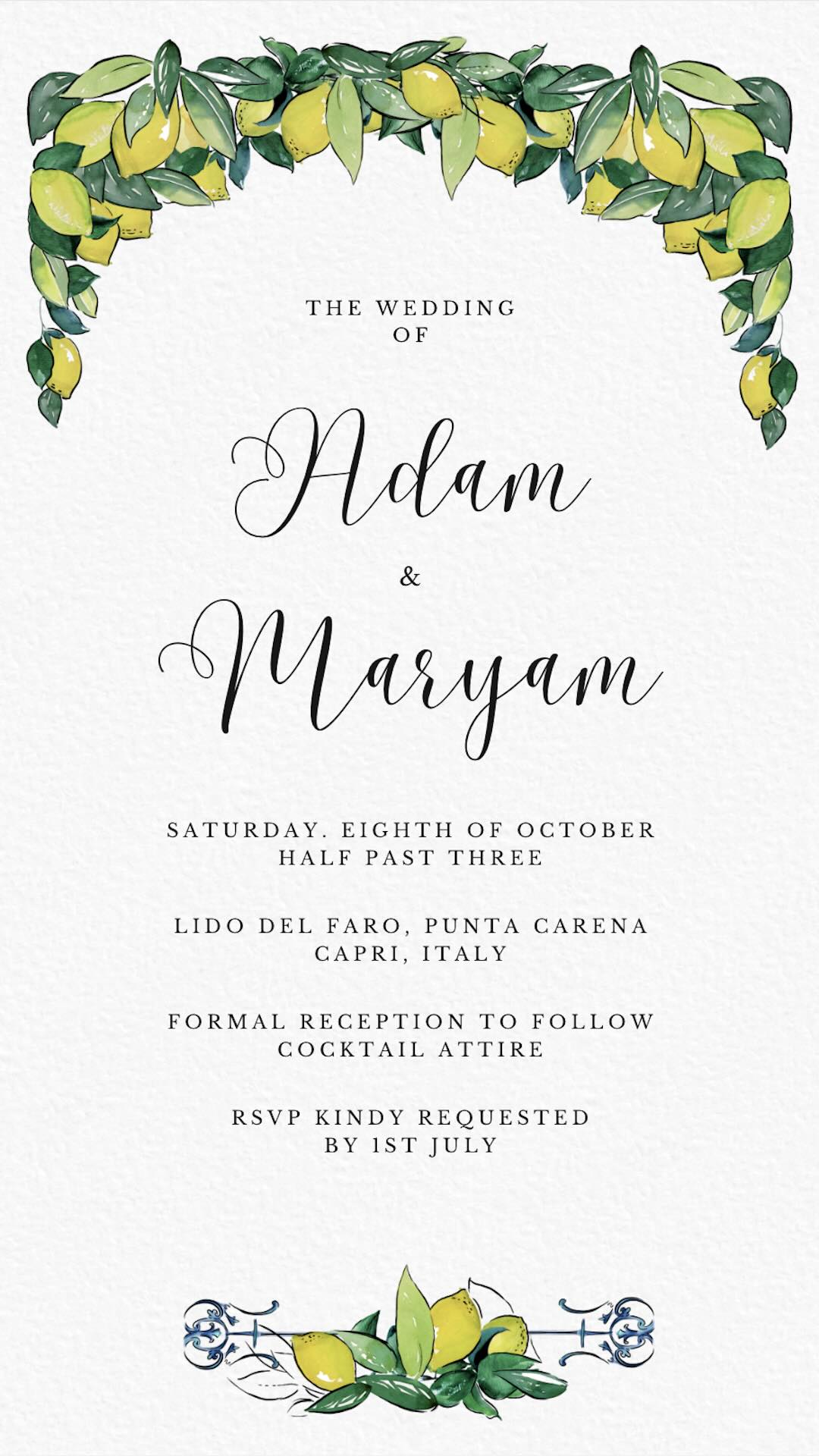
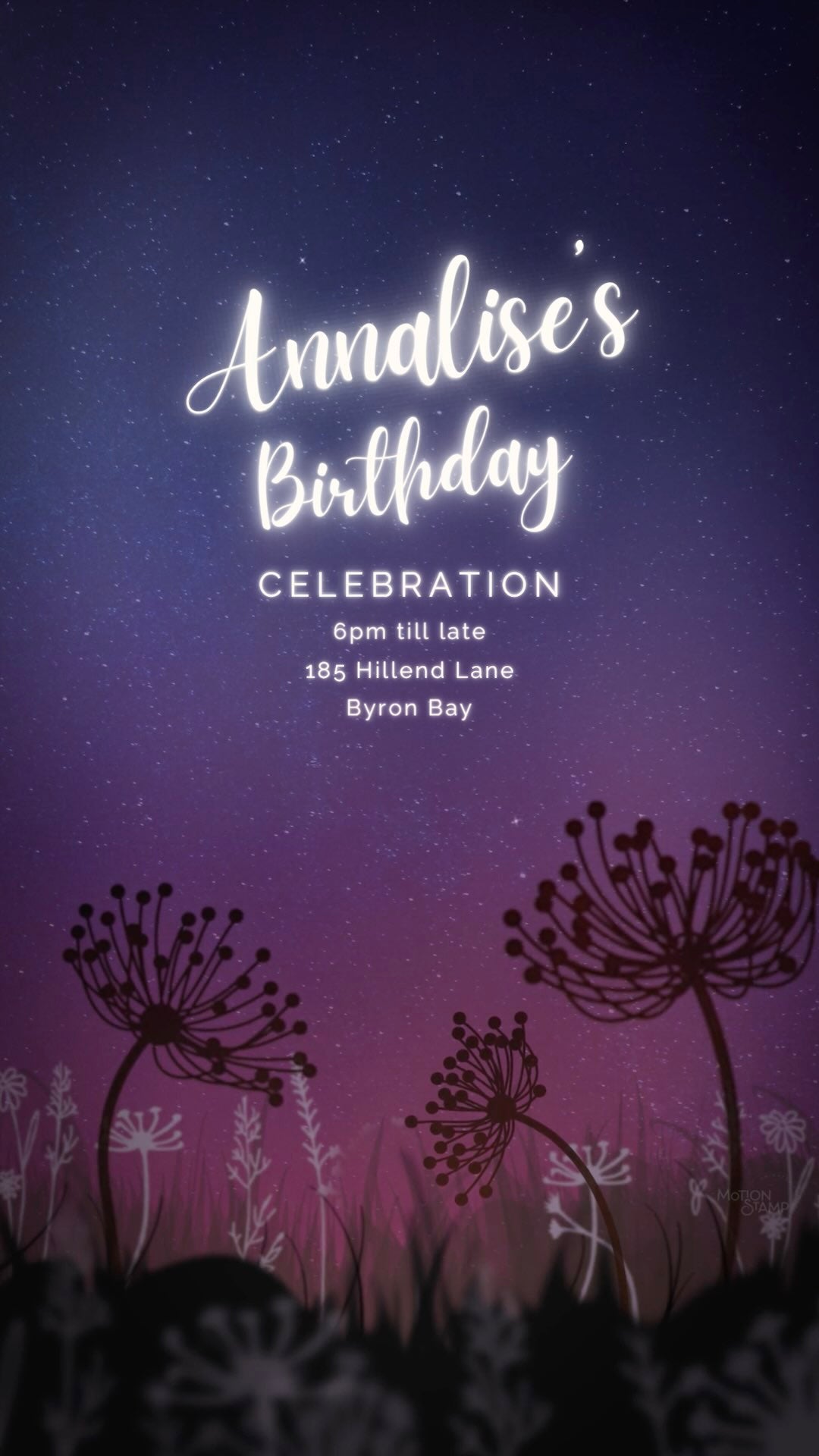
Discover great Canva Font combinations as well as how to create your own pairings.
Selecting appropriate font combinations is crucial for design, whether digital, personal, print, or brand-related. Fonts transcend mere text styles; they evoke emotions, tell a story, and create an aesthetic. Typically, they are also influenced from historical styles, and convey your written communication's impression and readability. Font pairings are essential in conveying the intended tone and message, creating a mood that aligns with the text's context. For instance, pairing an elegant script font with a modern sans-serif suggests sophistication, while combining a bold serif with a playful handwritten font creates a casual, friendly vibe.
Font combinations significantly impact readability and comprehension. An unsuitable pairing can make text challenging to read, disrupting the flow and distracting the reader. Conversely, harmoniously paired fonts enhance readability, guiding readers smoothly through the content. Well-paired fonts maintain consistency and coherence, making text engaging and easier to digest.
In PART 1 we have curated a great collection of Canva font ideas for your to draw upon.
In PART 2 we list the key ingredients that create great font combinations, to ensure a cohesive visual identity and establishes a clear tone, and gives you the ability to think about how to edit your own styles.
Best Paired Fonts in Canva
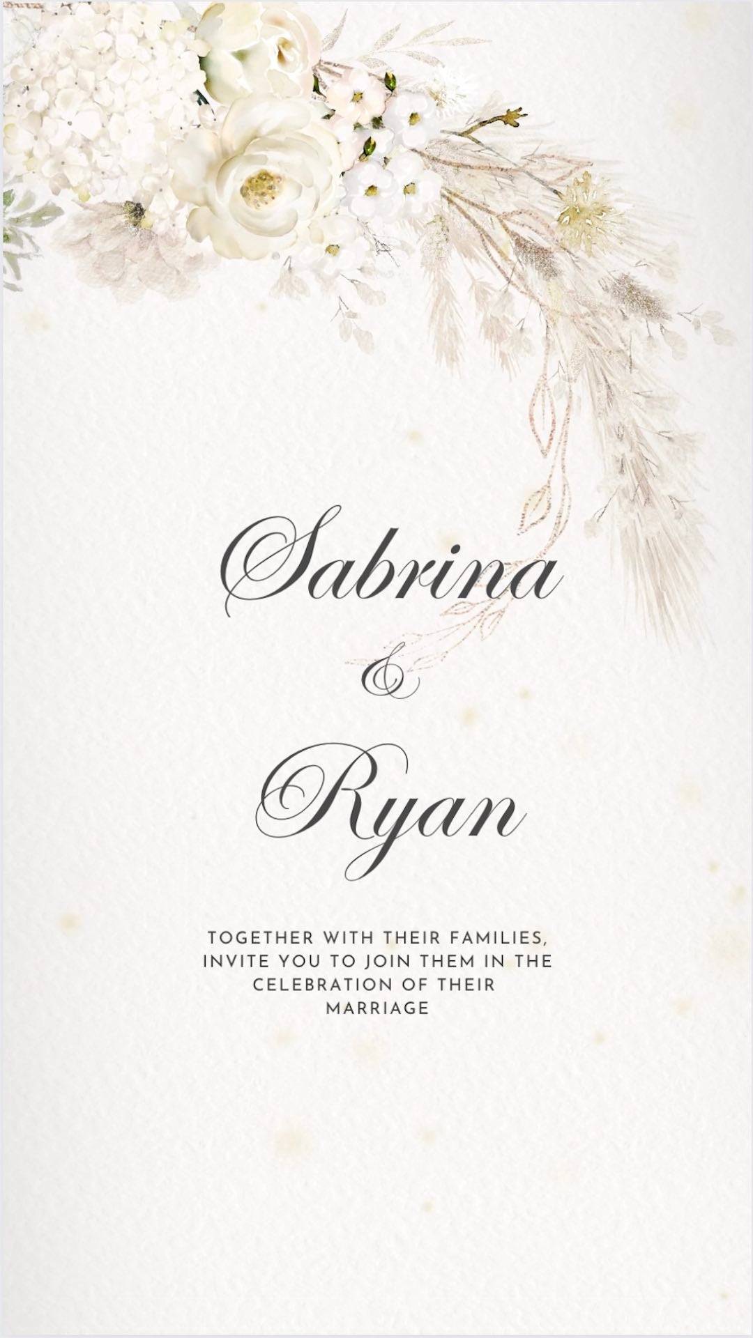
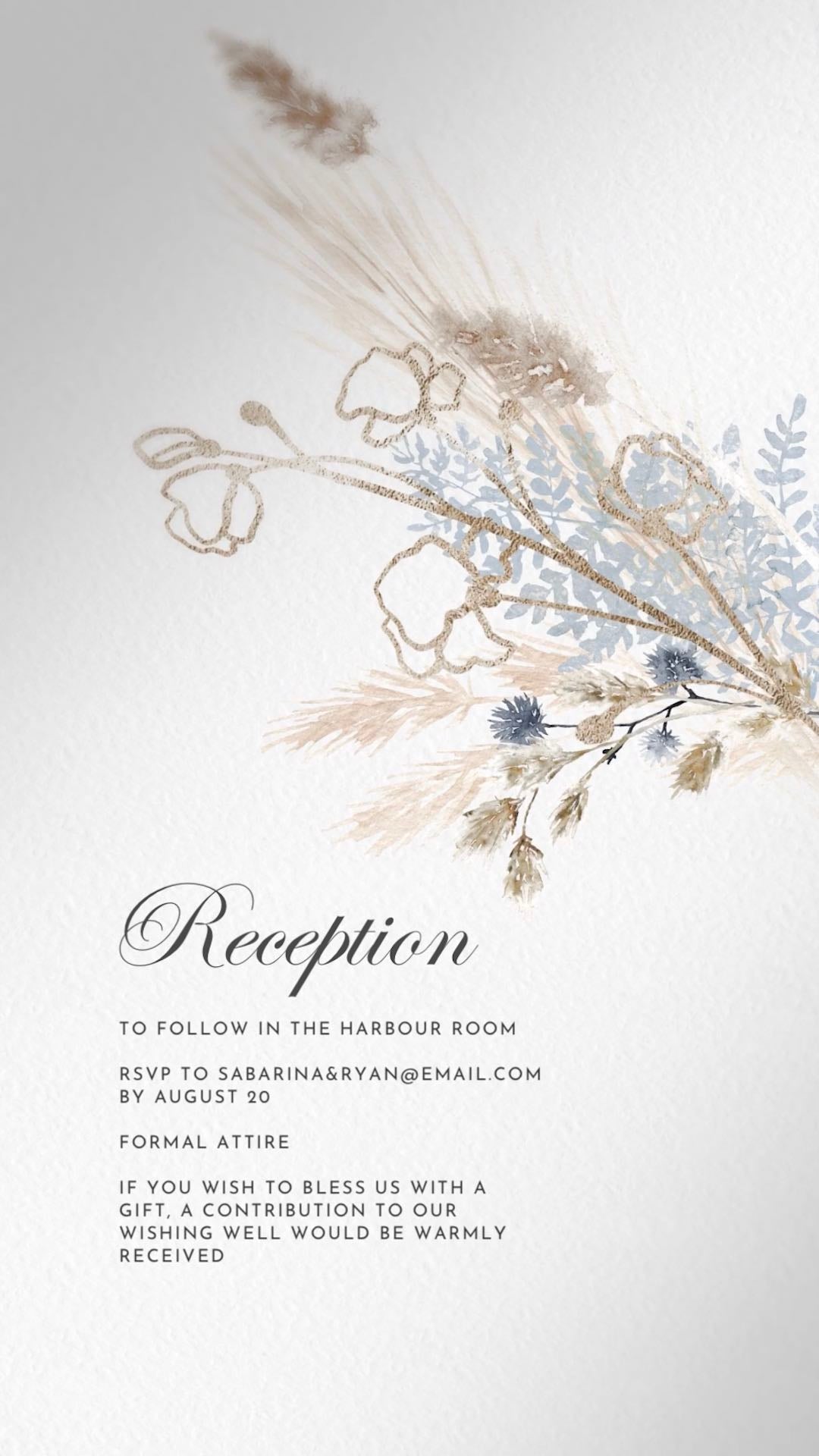
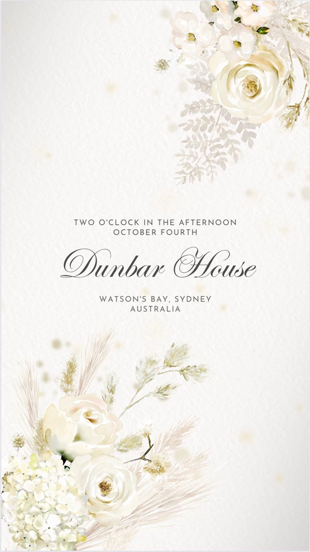
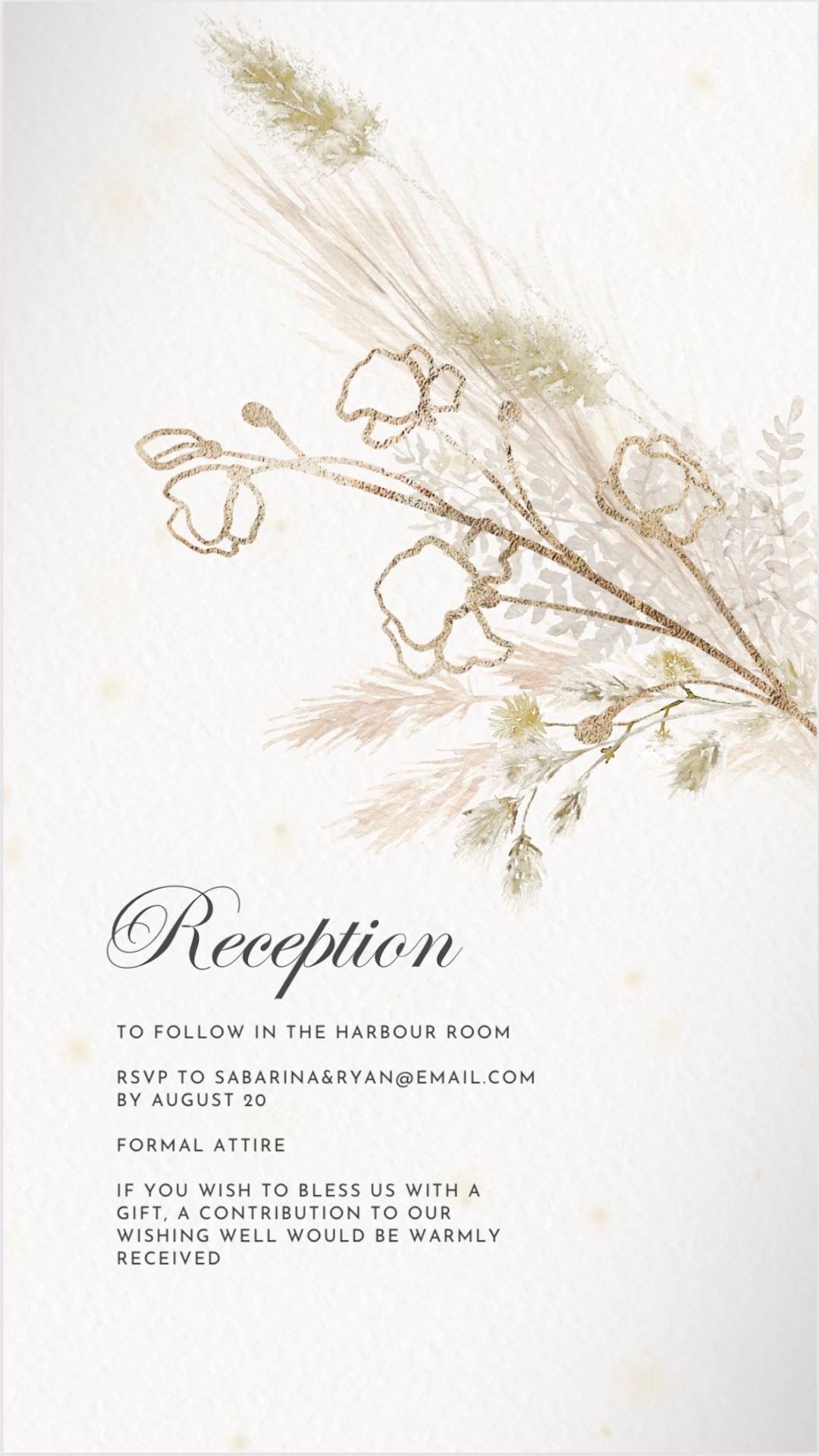
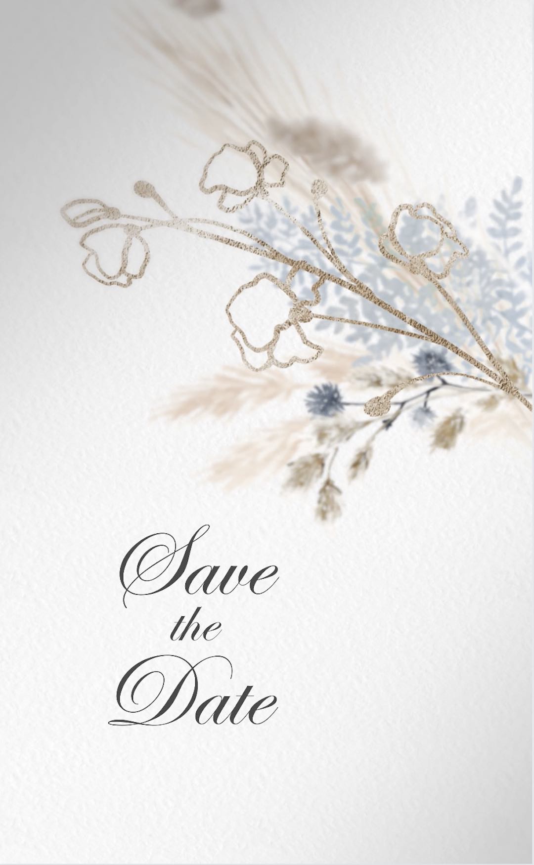
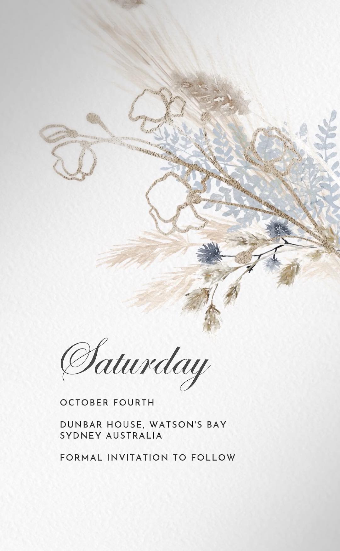
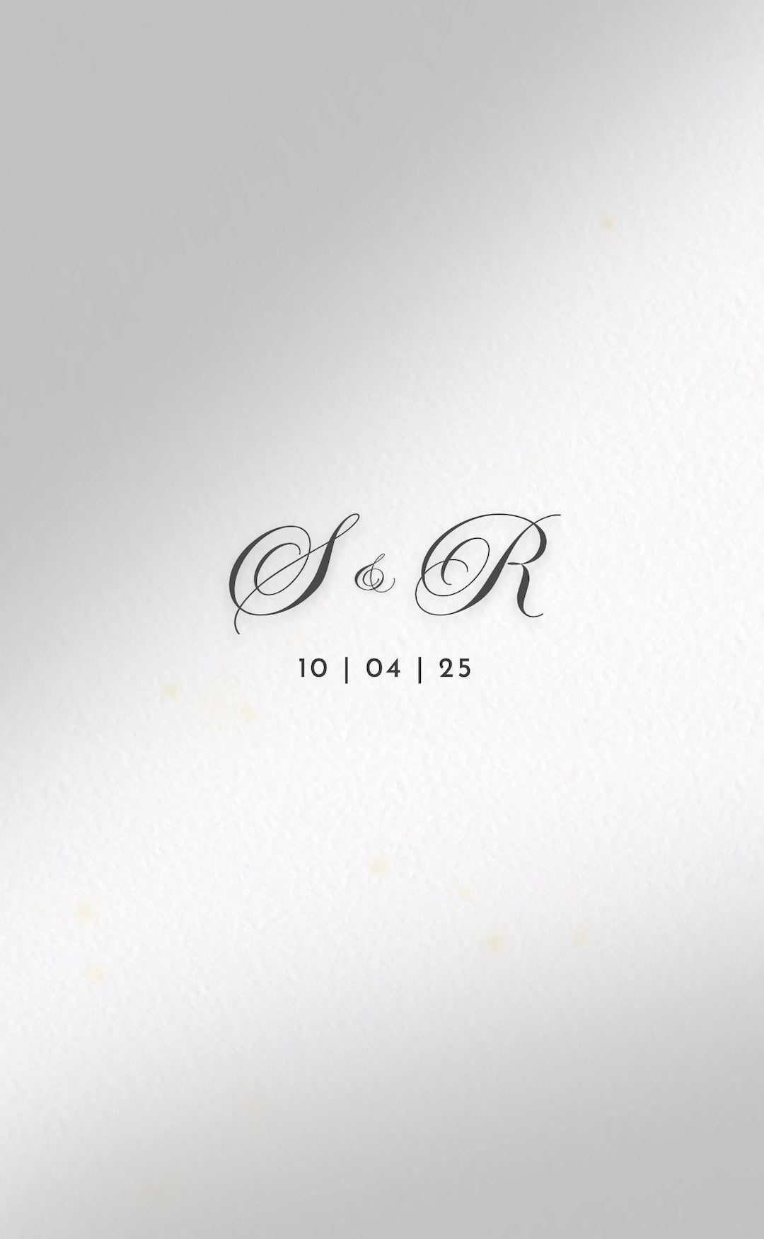
A combination of styles encompassing wedding, vintage, casual handwritten and minimalist font themes.
Wedding Fonts
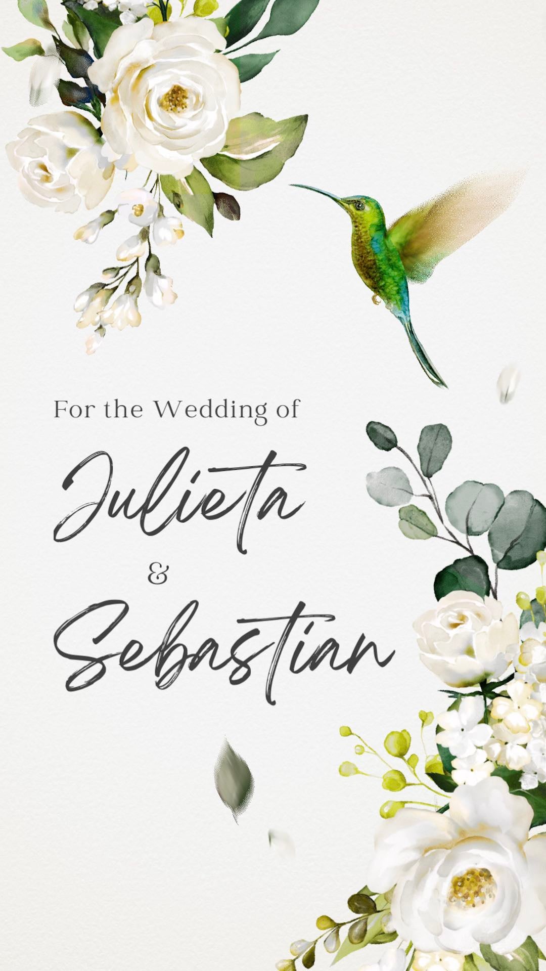
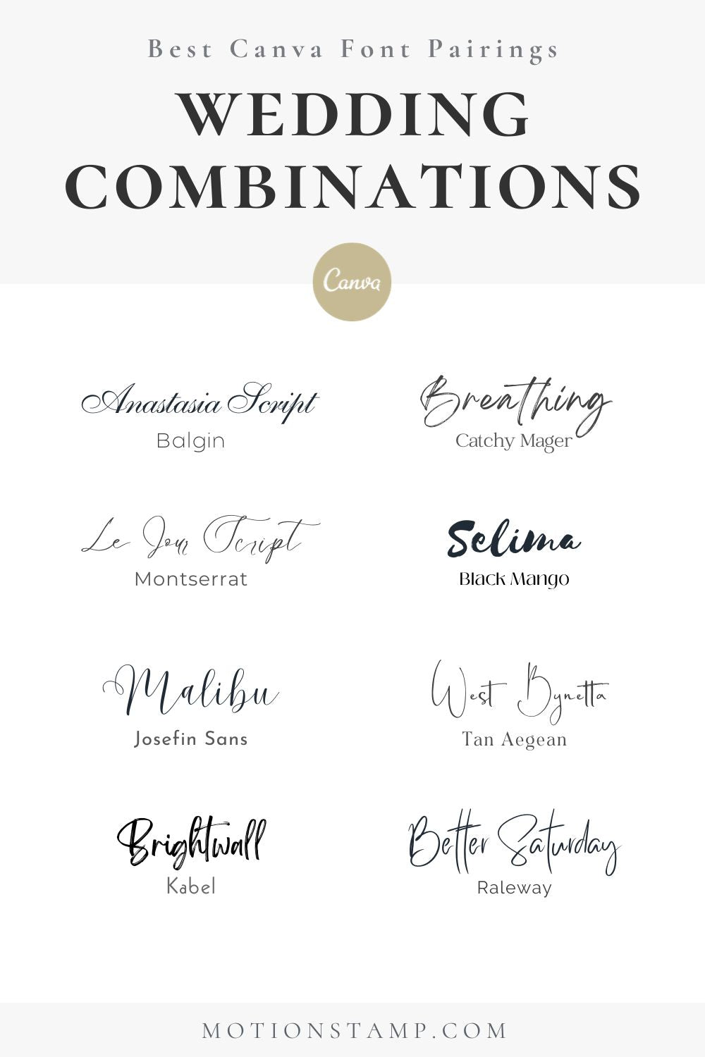
Choosing the right font pairing for wedding invitations is a pivotal element in setting the desired mood and theme for your special day. A successful font combination should strike a balance between elegance, readability, and personality. keeping the number of fonts limited to two or three maintains consistency and visual harmony across your wedding stationery. Ultimately, a good font pairing for weddings should reflect the couple's style, encapsulate the essence of the event, and create a lasting impression on guests. Some great examples are:
- Anastasia Script + Balgin
- Breathing + Catchy Mager
- Le Jour Script + Montserrat
- Selima + Black Mango
- Malibu + Josefin Sans
- West Bynetta + Tan Agean
- Brightwall + Kabel
- Better Saturday + Raleway
Vintage Fonts
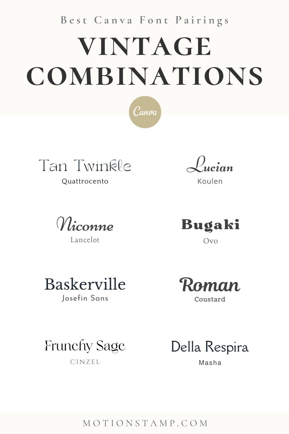
Vintage-themed designs often evoke nostalgia and charm, and choosing the right font pairing can enhance this aesthetic. Opting for fonts that reflect the elegance and character of a bygone era is crucial. For a vintage-inspired, consider pairing a decorative script font with a classic serif font. Ultimately, a well-chosen vintage font pairing sets the stage for a design brimming with old-world charm and romantic allure.
- Tan Twinkle + Quattrocento
- Lucien + Koulen
- Niconne + Lancelot
- Bugaki + Ovo
- Libre Baskerville + Josefin Sans
- Roman + Coustard
- Frunchy Sans + Cinzel
- Della Respira + Masha
Hand Written Fonts
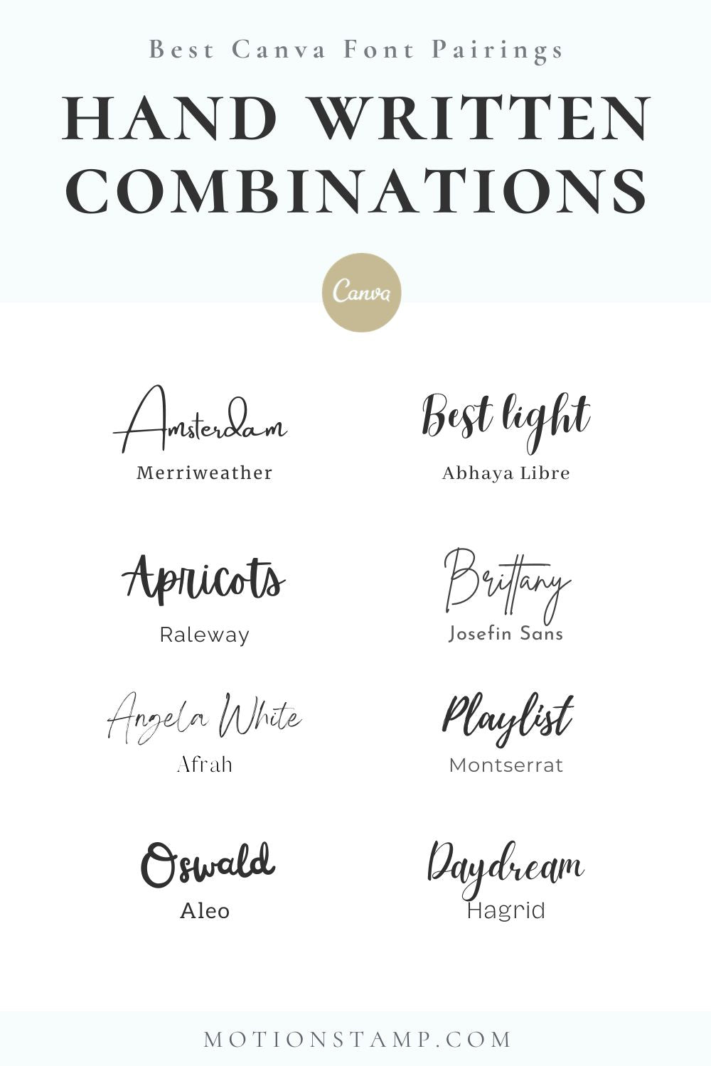
Crafting a design with handwritten fonts offers a personalized and intimate touch, infusing warmth and character into every detail. When considering handwritten font combinations, seek a blend of complementary styles that evoke a sense of individuality and charm. Pairing a casual and playful handwritten font with a more structured and readable sans-serif, or serif font can create a delightful contrast.
- Amsterdam + Merriweather
- Best Light + Abhaya Libre
- Apricots + Raleway
- Brittany + Josefin Sans
- Angela White + Afrah
- Playlist + Montserrat
- Oswald + Aleo
- Daydream + Hagrid
Minimalist Fonts
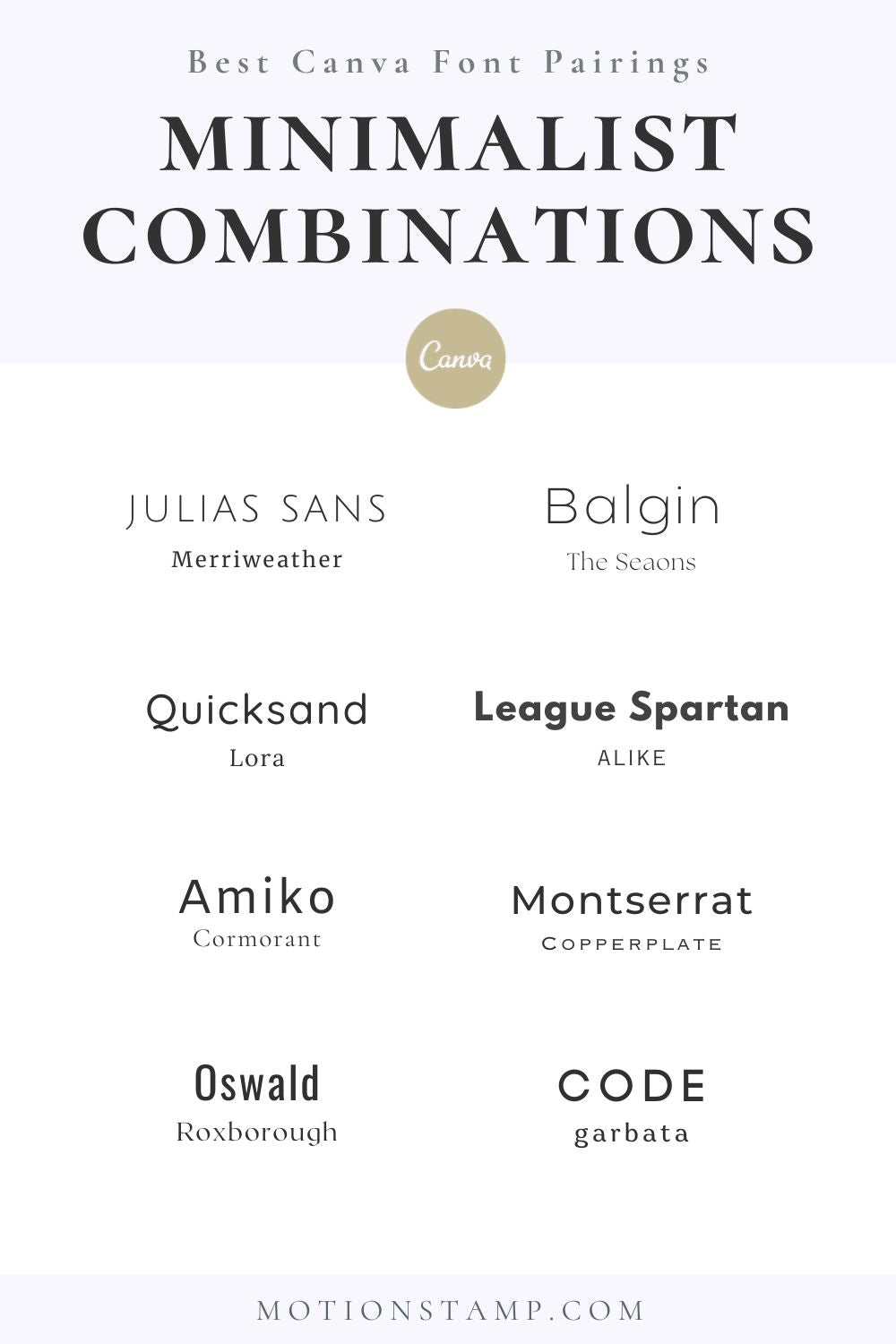
Creating minimalist font pairings involves a careful balance between simplicity and sophistication to create a clean, refined aesthetic. Start by selecting fonts that exude simplicity and clarity, favoring clean lines and minimal embellishments. Opt for a combination of sans-serif fonts with subtle differences in weights or styles. Stick to two fonts at most to maintain a minimalist look while ensuring readability. Establish a hierarchy by using one font for headers or titles and another for body text, ensuring contrast without overwhelming the design. Pay attention to spacing, alignment, and consistent sizing to create a harmonious visual flow. Minimalist font pairings thrive on simplicity, precision, and purposeful design, elevating the overall aesthetic while maintaining a sleek and modern appeal.
- Julias Sans + Merriweather
- Balgin + The Seasons
- Quicksand + Lora
- League Spartan + Alike
- Amiko + Cormorant
- Montserrat + Copperplate
- Oswald + Roxborough
- Code + Garbata
How to make your own font pairings in Canva
We explain the key 8 design points to consider with font pairing, so you have the tools to make your own combinations.
Hierarchy and Contrast:
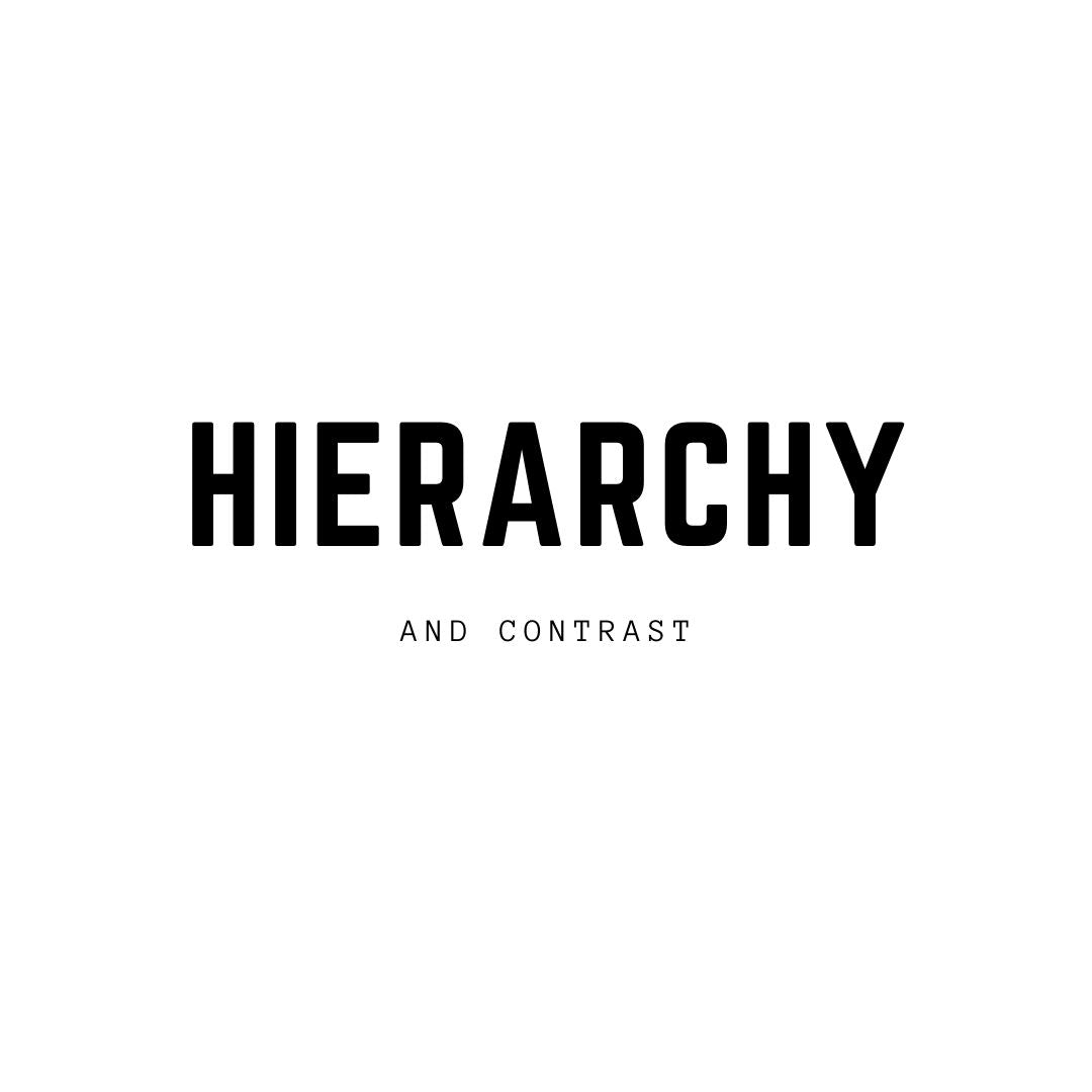
Create a clear visual hierarchy by varying font sizes, weights, and styles to distinguish between headers, subheaders, and body text. Utilize Canva's font options to achieve this hierarchy effectively.
Imagine you're telling a story with different chapters and sections. In typography, hierarchy helps you tell that story by guiding your reader. You might want the title to stand out, so it’s big and bold, ensuring the reader sees this first. While subtitles are a bit smaller, looked at next in a supporting role. Contrast helps you create these differences, making your design more interesting and easier to follow. Imagine a painting where the main subject is bright and bold while the background is softer – that’s contrast! It’s really important because it helps organize your design, making it clear and enjoyable to read.
Consistency and Cohesion:
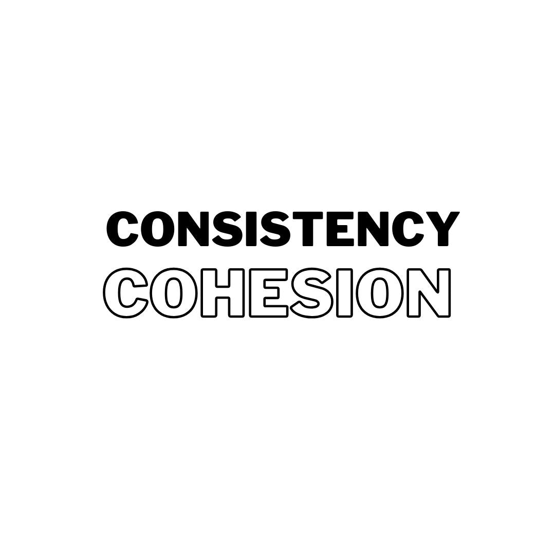
Maintain consistency in typography throughout your design. Stick to a limited number of fonts and styles to ensure visual coherence and a unified look in Canva. 2 or 3 different fonts is a great number.
Think of this as having a set of matching Lego blocks to build something. In typography, it means using the same font styles, like choosing one font for titles and another for the body text, and using them consistently throughout your project. This helps your design look neat and tidy, just like when you paint a picture and use the same colors to create harmony.
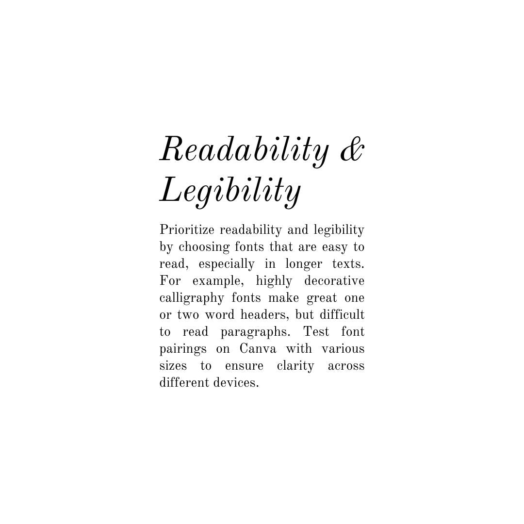
Readability and Legibility
Prioritize readability and legibility by choosing fonts that are easy to read, especially in longer texts. For example, highly decorative calligraphy fonts make great one or two word headers, but difficult to read paragraphs. Test font pairings on Canva with various sizes to ensure clarity across different devices.
Think of reading a book – you want the letters to be clear and easy to understand. Readability is how comfortable your text is to read, especially when it’s long. Legibility is about how clear the letters are – you don’t want them to be fuzzy or hard to see. These are super important because you want people to easily understand what you're saying.
Whitespace and Alignment
Use whitespace (empty space around your text) effectively to enhance readability and allow the text to breathe. Think of Whitespace as the silence between musical notes – it helps create harmony.
Ensure proper and neat alignment of text elements within Canva's design grid for a clean and organized layout. This means lining text up on borders and having them evenly spaced apart where appropriate.
Alignment is how your text lines up - left, right, or center. Good alignment keeps your design looking organized and makes it easier for your readers to follow along. It's like organizing your desk - when things are arranged neatly, it’s more pleasing to the eye and easier to use.
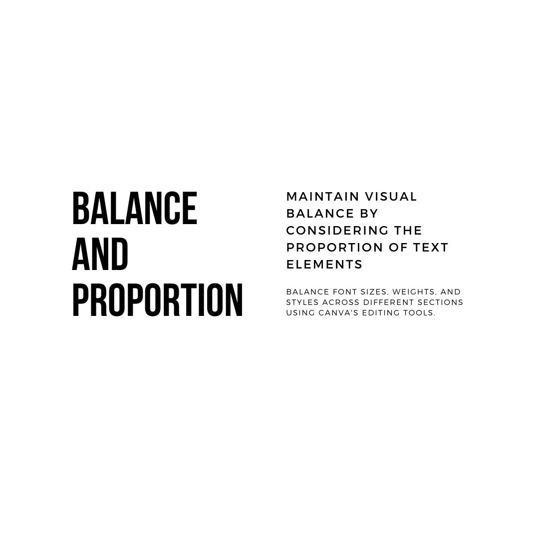
Balance and Proportion
Maintain visual balance by considering the proportion of text elements in your design. Balance font sizes, weights, and styles across different sections using Canva's editing tools.
Balance is about distributing the elements in your design so that it feels stable. It's like balancing a see-saw - you want both sides to be equally weighted. For example, one large design element on the left of screen, while many smaller elements to the right.
Proportion is about the relationship between different elements - like the size of the title compared to the size of the body text. If one part is too big or too small, it might look odd. It's important because a well-balanced design feels comfortable and natural to look at.
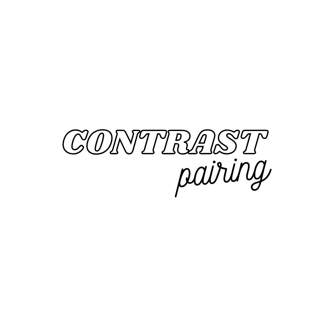
Contrast in Font Pairing
Pair fonts with contrasting styles to create visual interest and hierarchy. Experiment with different font combinations available in Canva to achieve a harmonious yet distinct look. For example, a large bold font header, balances with thinner smaller paragraphs.
Contrast is pairing fonts that are different but work well together. It's like having a harmony between different notes in a song – they're different but create a beautiful melody. Pairing fonts with different styles or weights can make your design more interesting and help guide your reader through the text. It’s important because it adds personality and uniqueness to your design.
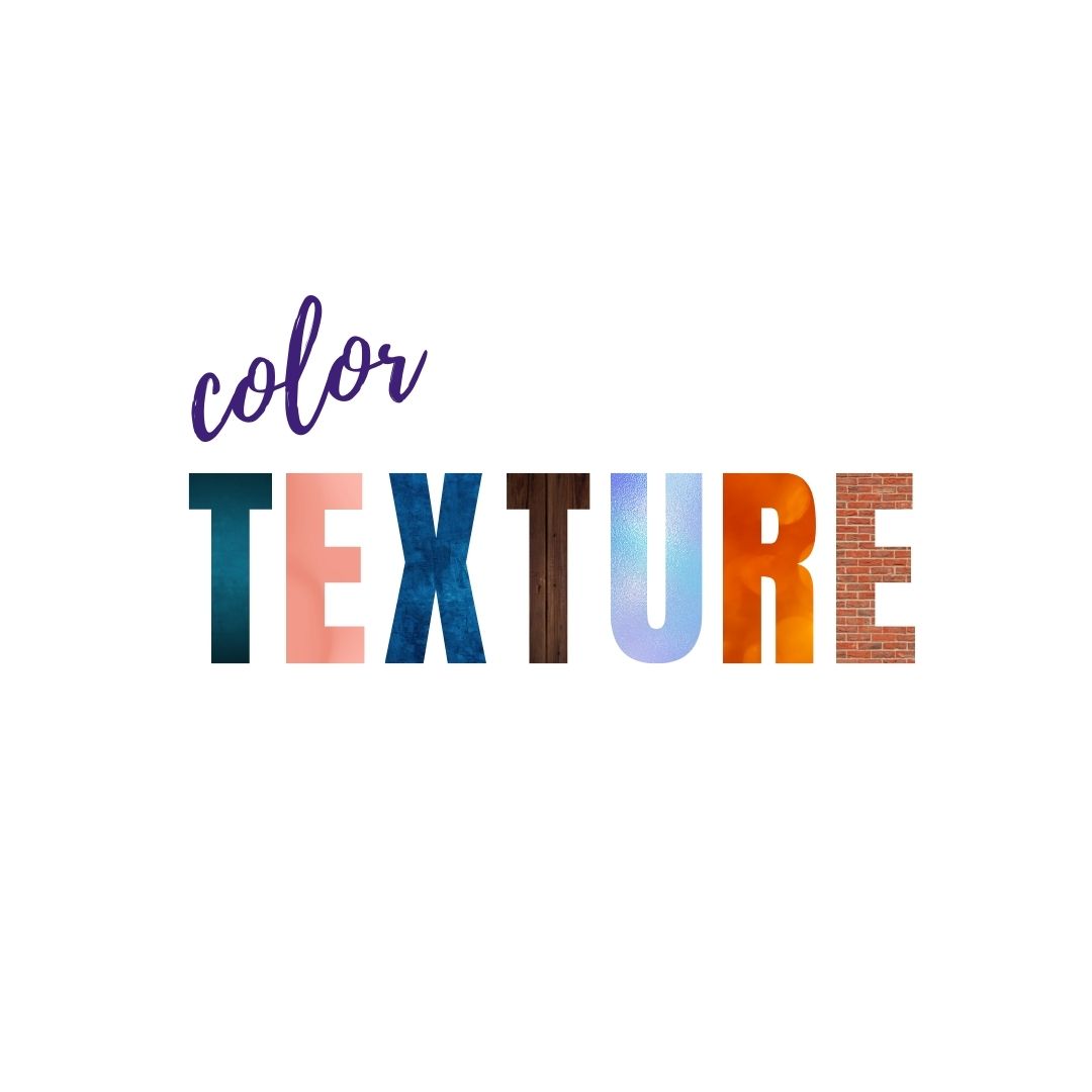
Color and Texture in Typography
Experiment with color and texture variations within typography to add depth and visual interest to your design. Canva allows you to apply color and texture effects to text elements seamlessly. Such as brush strokes effects, or fonts with transparency.
Color and texture in typography are like adding flavors and spices to a dish. They can bring depth and interest to your design. Using color and texture effects on text can make it more visually appealing and add character to your overall design. Colors can create moods too - like warm colors make you feel cozy, while cool colors can feel calming.
Experimentation and Iteration
Continuously experiment with various typography options available in Canva. Iterate on font pairings, sizes, and styles to find the best combination that suits your design's objectives and aesthetics.
Think of typography as an art. Just like painters try different strokes, you can try various font combinations to see what looks best. Experimenting with fonts and styles in Canva lets you explore and find what suits your design. Iterating means trying again and again, refining your design until it's just right. It’s important because it encourages creativity and helps you discover new ideas.
Ready to customize your font and design?
We hope you enjoyed learning about fonts pairings in Canva. To learn about even more font options and style, read our article 'Best Canva Fonts for Weddings and Invitations'.
Motion Stamp provides sophisticated and budget-friendly animated Canva Invitation Templates available for immediate download and simple customization. Tailor each template to suit your preferences by selecting fonts, adjusting colors, modifying timing, and choosing music options. Upon purchase, you can effortlessly publish and distribute numerous exquisite digital invites on the very same day! These templates streamline the process of personalizing an invitation in Canva, making it incredibly convenient. Explore the Motion Stamp collection today, and discover our array of Canva invitation templates, ideal for commemorating any significant event.
